The Xamin plot web interface uses the plotting capabilities of the plot.ly Jabvascript plotting library developed by Mark Taylor.
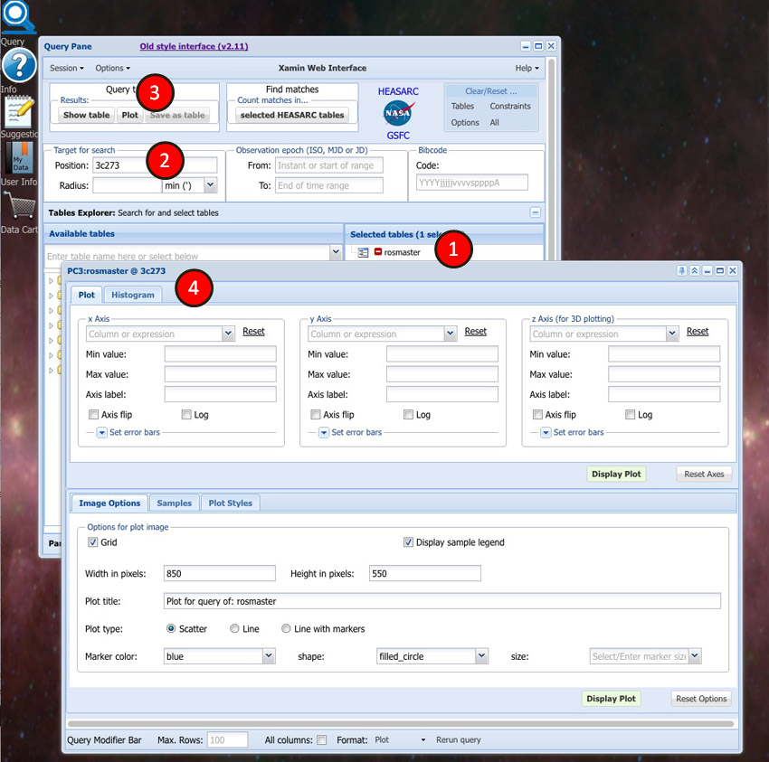
1. Start by selecting ROSAT Archival Data (rosmaster) in the Select Tables section of the Query Window.
2. Enter target 3C273 in the Position input box.
3. Click the Plot button
4. The Plot Control form is displayed. This form allows you to plot query data in two or three dimensions.

Now we can start making selections to create our plot.
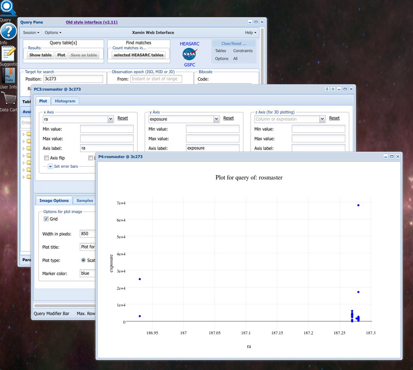
1. First select the fields you want to plot. Select ra from the pulldown menus for the X axis, exposure for the Y axis. The pulldown menu will include the default numeric fields for the selected table.
2. The appearance of plots can be adjusted by selecting the various options (eg., plot title, plot marker size, shape, color) in the Image Options tab. Various output formats can also be selected in this tab. We'll leave the selections at the default values for this first plot.
3. Click the Display Plot button.
 ">
">
The simple ra vs exposure plot with the default Image Options selections for a rosmaster table of target 3C273 is shown below.
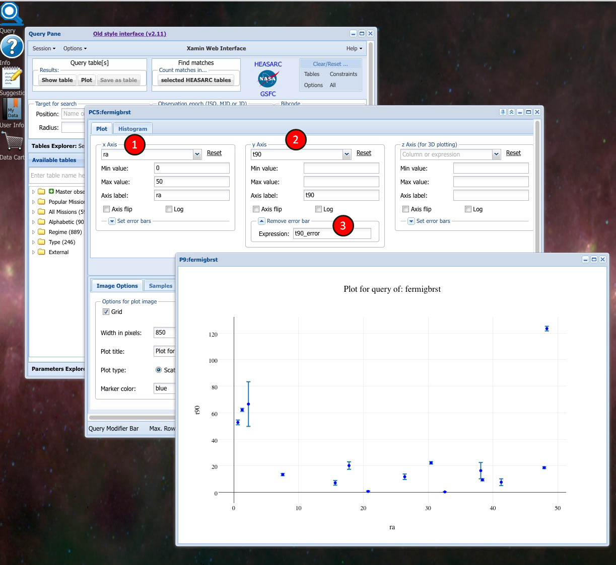
1. Select ra from the X axis pulldown menu
2. Select t90 from the Y axis pulldown menu
3. Click the Set error bars expansion triangle in the Y axis section to expose the error input box.
4. An expression or a column name can be entered into the error input box. If the column name selected from the pulldown menu has an associated error field it will automatically be displayed in the input box. In our example the t90 field has an associated error field (t90_error) so it appears in the box. If you do not want to display error bars simply click the expansion triangle to turn this option off
5. Click the Submit button to display the plot.
To illustrate the use of Samples and some other plot options we'll go through an example step by step start to finish. The object will be to plot gamma ray bursts that are in the Swift Master Catalog for the years 2009 and 20010.
1. We'll start at the Query Window and select the Swift Master Catalog (swiftmastr) from the Select Tables section .
2. Select All Fields under Output Content in the Options Menu.

3. Enter a Time range of 2009-01-01 to 2009-12-31
4. Click the Plot button
5. The Plot Control form for the Swift Master catalog will appear.
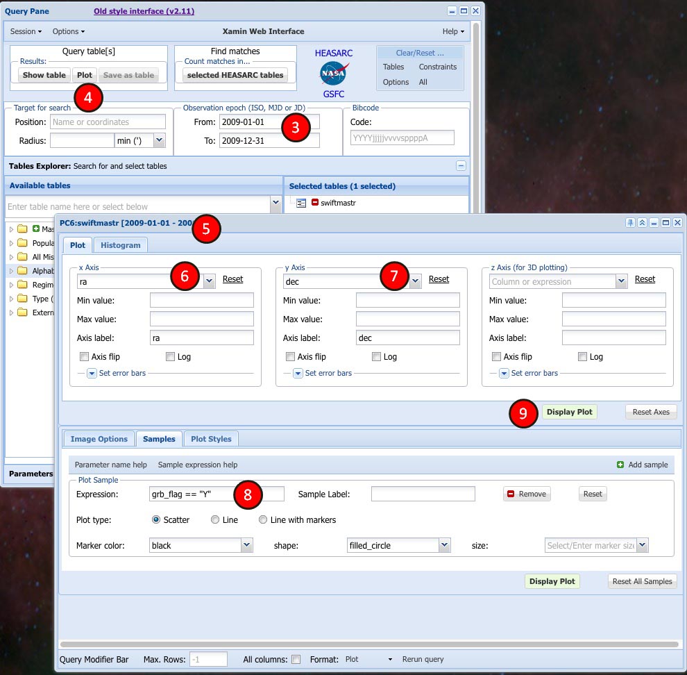
Now we will make selections to plot all the observations in the Swift Master Catalog for the years 2009-2010.
6. Select ra in the column pulldown menu for the X axis
7. Select dec in the column pulldown menu for the Y axis
8. Enter a sample expression. Here we are asking to plot only gamma ray burst data during that time period.
9. Click the Display Plot button
A ra x dec plot of all Swift Master Catalog observations of gamma ray bursts for 2009-2010 will appear.

1. Click the Add sample button and a new sample section will appear below the first.
2. Enter the expression grb_flag != 'Y'
3. Enter the description non GRBs as Sample label
4. Choose a contrasting marker color and marker size, if desired

A ra x dec plot of all gamma-ray bursts and non gamma-ray bursts observed by Swift in 2009-2010 will appear.
Click the sample legend text ("GRBS", "non GRBs") in your plot to turn off/on each sample's data.

This tutorial demonstrates how to plot location and duration values of gamma ray bursts:
1. Select the Gamma-Ray Bursts Catalog (grbcat) from the Query Window
2. Change the Max Rows setting under Query Control in the Options Menu to -1 to include all grbcat data.
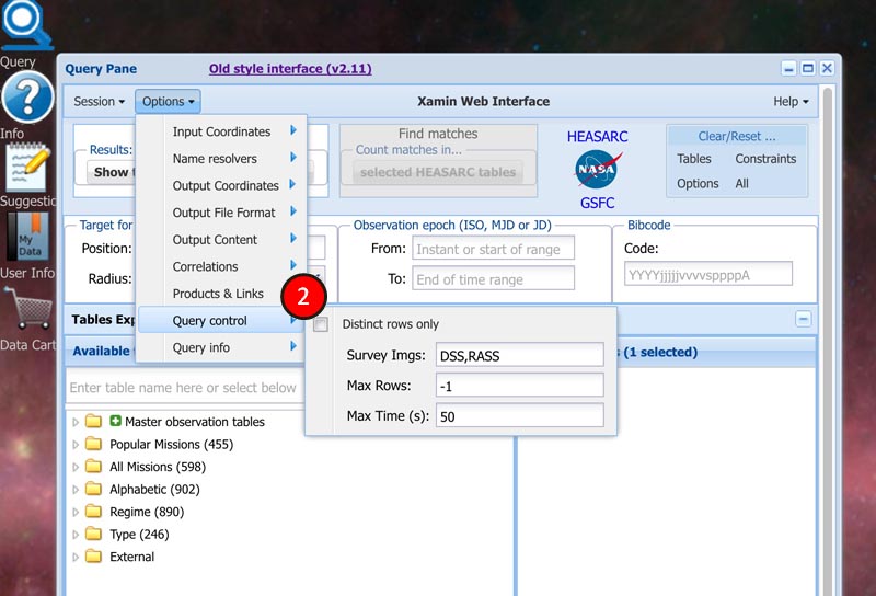
3. Select All Fields under Output Content in the Options Menu (As decribed above in the Samples Section).
4. Click the Plot button
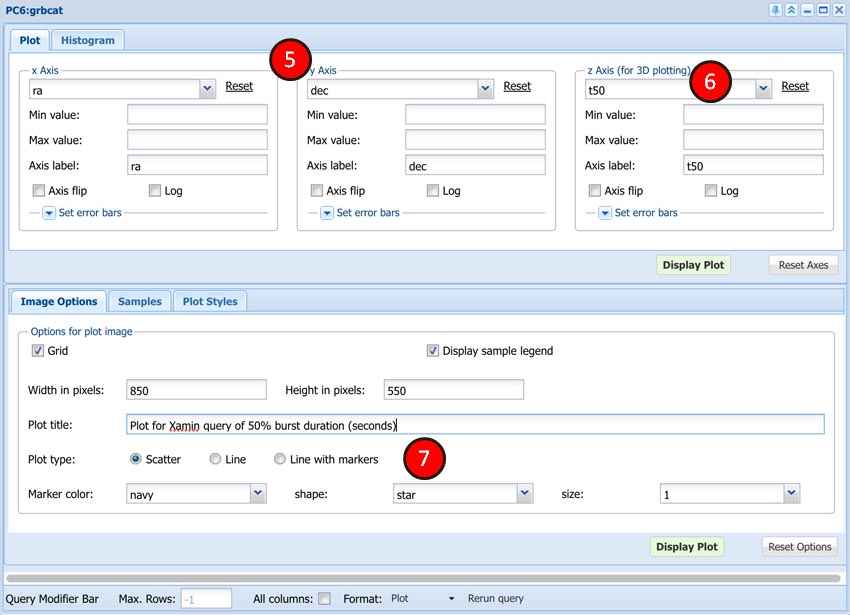
5. In the resulting Plot Control form select ra from the pulldown menu for the X axis and dec for the Y axis
6. Select T50 for the Z axis
7. Make any other desired changes. We've changed the plot title and made color and shape changes for the plot markers.
8. Click Display Plot
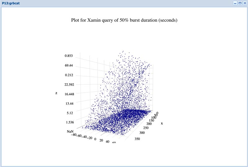
A ra x dec x T50 plot of gamma-ray bursts of various durations are distributed in space will appear.
Note that clicking moving the cursor around in the 3D plot window will show different views of the axes.
1. Click the Histogram Tab to display the Histogram Form.
2. Select time for the X axis
3. Make any other desired changes. We have changed the Plot title and Marker color
5. Click Display Histogram
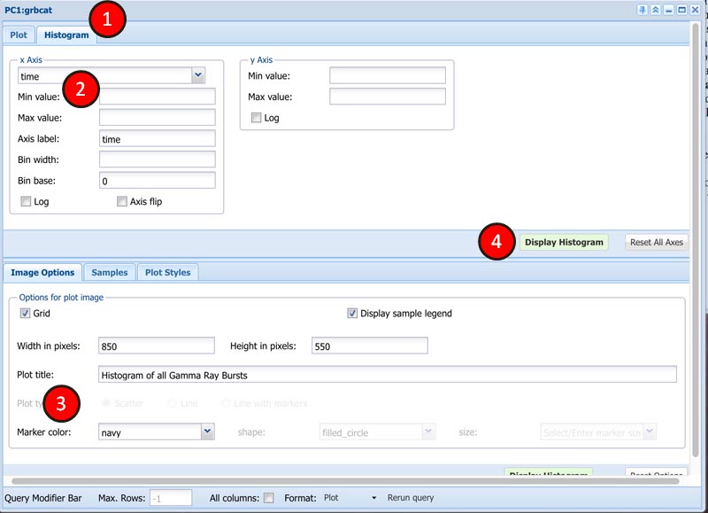
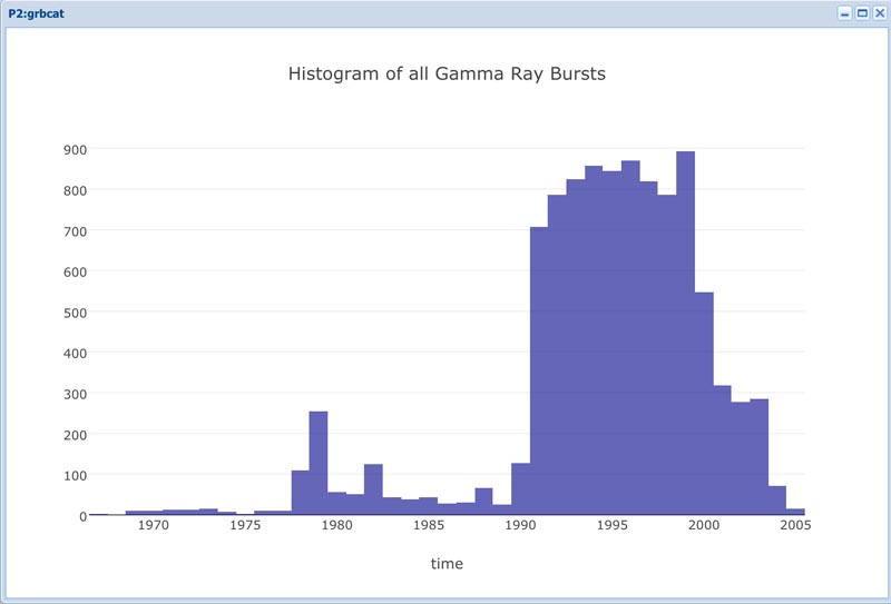
Here is the histogram
